Responsive Web Design Animation on a Smartphone
By alphamotion1999One great value subscription from €14.50/month
- Unlimited downloads of 27+ million creative assets
- AI Tools: video, image and more
- Lifetime commercial license
- Easy cancellation
Already have an account? Sign in
Attributes
- Length
- 0:16
- Resolution
- 1920 x 1080
- File Size
- 63.4 MB
- Frame Rate
- 29.97 fps
- Alpha Channel
- Yes
- Looped
- No
- Video Encoding
- ProRes
- Orientation
- Horizontal
- Commercial License
- Further Information
Description
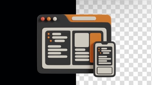
This animated clip showcases responsive web design principles on a smartphone. A stylized mobile device appears, displaying a webpage layout that dynamically adjusts its elements, such as text blocks and image placeholders, to fit the screen size. The word 'Responsive' animates into view above the device, emphasizing the adaptability of the content. Featuring a clean, flat design aesthetic with clear, distinct shapes and a limited color palette, this visual effect is ideal for presentations, educational content, or marketing materials focused on technology, web development, user experience, or digital products, effectively communicating the concept of flexible UI across various screen sizes.