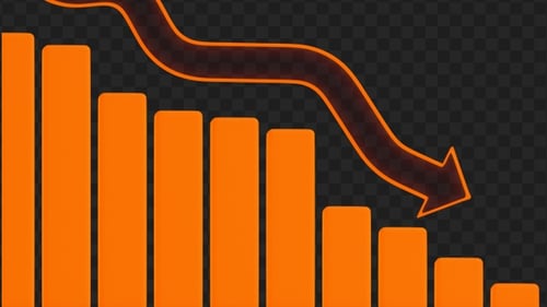
Bar Graph Decline
By Pojok_kamarOne great value subscription from €14.50/month
- Unlimited downloads of 27+ million creative assets
- AI Tools: video, image and more
- Lifetime commercial license
- Easy cancellation
Already have an account? Sign in
Attributes
- Length
- 0:06
- Resolution
- 2560 x 1440
- File Size
- 238 MB
- Frame Rate
- 30 fps
- Alpha Channel
- Yes
- Looped
- Yes
- Video Encoding
- ProRes
- Orientation
- Horizontal
- Commercial License
- Further Information
Description
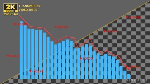
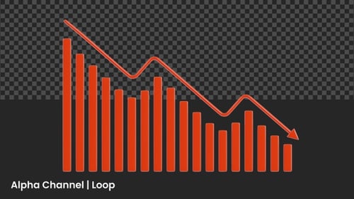
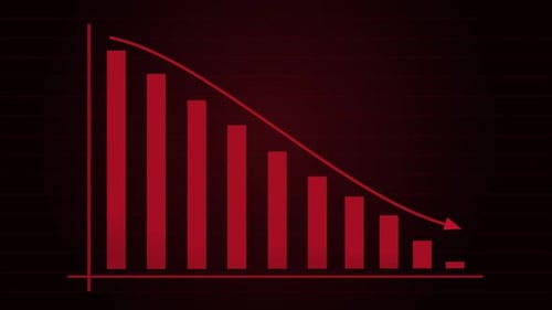
This 3D animated sequence features a red bar chart set against a clean white grid, illustrating a clear downward trajectory or economic decline. The animation begins with the bars populating from left to right, while a prominent red arrow line tracks the falling values across the coordinate system. Against a solid black background, the high-contrast visuals provide a stark representation of negative growth, market crashes, or decreasing performance metrics. The smooth motion of the bars rising and the arrow descending offers a professional way to visualize data in corporate presentations, financial reports, or news segments. By focusing on simple geometry and a bold color palette, this visual tool effectively communicates complex statistical information in a digestible format for viewers. It is designed to integrate seamlessly into business-oriented projects that require clear infographics to tell a story of loss, failure, or strategic shifts. The clean lines and perspective-driven layout enhance the depth of the data visualization, making it suitable for high-end video productions. This asset helps creators emphasize negative outcomes or quarterly losses with impact and clarity.